Fontmaker - Font Keyboard App
- 4.3
- Rating
- 5.00M
- Installs
- Free
- Price
 Analysis by App-foxy
I like productivity apps that change a small part of my routine without asking me to rebuild the whole routine around them. Fontmaker - Font Keyboard App takes that approach by turning my own handwriting into a usable keyboard font. Instead of choosing another polished typeface, I can write in a personal style and use that style when typing on my phone.
That idea sounds simple, but its value depends on what I want from a message. This is not a replacement for a full writing suite, a design editor, or a serious note-taking system. It is a personal-expression tool inside the productivity category, developed by Sociaaal LLC, and its main appeal is the direct connection between handwriting and everyday digital text.
The app is free to start, is suitable for Everyone, and supports devices running Android 8.0 or later. It has reached over a million installs, with a 4.2 average from roughly 72 thousand ratings and about 1.6 thousand written reviews. Those figures suggest that the concept has found a sizeable audience, but I still think the right question is not whether it is popular. The useful question is whether a handwriting keyboard fits the way you communicate.
You May Also Like

 Blood Strike: 2.5 Anniversary
Blood Strike’s Loadouts Turn Every Drop Into a Tactical Gamble
A close look at Blood Strike’s custom loadouts: how fast access to signature weapons reshapes its battle royale rhythm, rewards preparation, and narrows the gap between fights.

 Pandora - Music & Podcasts
Pandora’s Music Is Easy to Start, but Harder to Recover
Pandora’s strength is its low-effort path from a seed to a station. Its weak spot is how much confidence it asks you to place in connection, setup, and quiet recovery.

 8 Ball Pool
 Is Built on Rivalries, Rematches, and Routine
A close look at the rivalries, rematches, shared routines, and unanswered safety questions that turn a quick pool match into a persistent mobile community.

 Samsung Music
’s Quiet Strength Is Playing What You Already Own
Its reach comes less from spectacle than from dependable access to a personal library. That simplicity is both the app’s strongest retention engine and its ceiling.

 AccuWeather: Weather Radar
AccuWeather Review: A Quick, Clear Forecast for Everyday Decisions
For everyday plans, the best forecast is the one you can understand quickly. AccuWeather makes rain timing, radar, and local conditions easy to act on, with a few trade-offs.

 Hill Climb Racing
Why Hill Climb Racing Still Turns Crashes Into One More Run
A tiny car, a bumpy hill and one more upgrade: Hill Climb Racing keeps resurfacing because its simple chaos makes every near-miss feel personal.
More From Our News Desk



Turning handwriting into a keyboard you can actually use
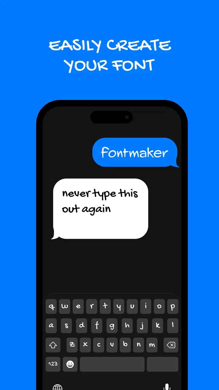
The central capability is personal font creation. Rather than downloading a handwriting font made by someone else, I can create a character style based on my own writing and then use it through a keyboard. That makes a typed message feel less anonymous, especially when a standard system font would make a note, caption, or short greeting look ordinary.
What makes this different from simply taking a photograph of handwriting is the keyboard aspect. A photo is fixed: it works for one page or one image. A handwriting-based keyboard is intended for repeated text entry, so the result can be used while composing messages or other short pieces of text. The practical effect is that my personal style becomes part of the typing process rather than a separate decoration added afterward.
I found that distinction most useful when I wanted text to feel informal and recognizably mine. A typed sentence in a handwriting font does not reproduce every physical detail of writing on paper, but it can preserve the overall impression: the rounded letters, unusual spacing, or slightly uneven personality that a default font removes.
There is also a useful boundary here. This is not a magic way to make every digital document look like a carefully scanned handwritten letter. The experience is better understood as a custom keyboard identity. It works best when the message is short enough for personality to matter more than perfect typographic control.
What the setup feels like in everyday use
The first step is preparing the handwriting style. I would approach that stage patiently instead of rushing through it. A font based on hurried, cramped writing may technically represent my handwriting, but it will not necessarily be pleasant to read. Clear letter shapes and consistent spacing matter more than trying to make the sample look artistic.
Once the style is ready, the important change is remembering to select the custom keyboard when I want to use it. That is a small but meaningful trade-off. The app adds personality to text entry, but it also introduces another keyboard choice into a routine where most people already rely on the default keyboard. If I only want the effect occasionally, switching back and forth can feel like extra friction.
For short messages, that friction is easy to accept. I can imagine using the handwriting style for a birthday greeting, a personal reminder sent to someone close, or a social caption where a standard typeface feels too formal. For long writing, though, I would probably return to a conventional keyboard. Speed, correction, and readability become more important as the amount of text grows.
A practical tip is to separate creation from use. I would create the font when I have time to check whether the letters are readable, then use it selectively rather than treating it as my permanent keyboard. That approach protects the novelty from becoming a nuisance and keeps the custom style meaningful when it appears.
A realistic scenario: making a quick message feel personal
Imagine that I am sending a short thank-you message after receiving a gift. A normal typed sentence communicates the words, but it can feel routine. With my handwriting style available through the keyboard, the same sentence gains a more personal visual character without requiring me to write on paper, photograph the note, crop the image, and send it separately.
That workflow is where the app makes the strongest case for itself. It sits between ordinary typing and a handwritten image. I retain the convenience of entering text digitally, while the appearance carries some of the warmth associated with handwriting. For people who regularly send small personal messages, that can be more useful than a large collection of unrelated fonts.
The same idea can work for a short social post or a personal status update. I would not use it for every post, because the effect would lose some of its distinctiveness. Used occasionally, however, it can help a message stand apart from the uniform appearance of ordinary typed text.
Another interesting use is a private digital journal or a list of intentions. The handwriting style can make the content feel more like a personal note than a sterile text field. I would still keep the writing brief and check the result before relying on it, especially if the font contains letters that are easy to confuse.
Where it is stronger than ordinary font alternatives
The usual alternative is a collection of pre-made fonts. Those can be attractive, but they give me somebody else’s handwriting style. A downloaded script font may look elegant, playful, or casual, yet it does not carry the same personal connection as a style based on my own writing.
Another alternative is a graphic design app. That route offers more control over layout, color, images, and spacing, but it is slower for a quick sentence. I would choose a design editor when the final result needs to be a carefully composed visual. I would choose this app when I want the text itself to feel personal with minimal preparation.
Writing by hand on paper and taking a photo remains better when the physical texture of ink, paper, and natural variation is the point. The keyboard approach is more convenient for digital communication, but it cannot fully replace the authenticity of an actual handwritten page. The choice depends on whether convenience or physical originality matters more in that moment.
Compared with a standard keyboard, the advantage is emotional rather than functional. I would not expect faster typing, stronger correction, or better long-form composition simply because the letters look handwritten. The gain is that the output feels more individual. That is a worthwhile difference for personal messages, but not a reason to abandon a familiar keyboard for every task.
The trade-offs I noticed before recommending it
The largest limitation is readability. My handwriting may be meaningful to me while still being difficult for someone else to interpret. A custom font can preserve quirks that I normally correct unconsciously when writing carefully. If the recipient is unfamiliar with my writing style, a decorative or uneven result may slow them down.
That makes testing important. I would type a few ordinary sentences, including letters, punctuation, and numbers that I use often, before deciding that the font is ready. I would also send a sample to someone who is not accustomed to my handwriting. If that person has to guess at several words, the personal effect has gone too far.
There is a second trade-off in consistency. Handwriting naturally changes with mood, speed, and available space. A font makes the style repeatable, but that repetition can also expose imperfections. A distinctive letter that looks charming once may become distracting when it appears many times in a paragraph.
The app also involves in-app purchases ranging from $0.99 to $8.99 per item. Since the app itself is free, I can try the basic experience before deciding whether any optional purchase is worthwhile. I would avoid paying simply because I enjoy the idea; I would first confirm that I actually use the custom keyboard often enough to justify spending money on it.
Keyboard apps deserve a little more attention than ordinary decorative tools because they participate directly in text entry. I would review the setup screens carefully, understand which keyboard I am selecting, and avoid treating the app as a background novelty that I never actively use. If I am uncomfortable changing keyboards or managing an additional typing option, the app may feel less convenient than it appears.
The current version is 1.8.9.70, and the app was released on November 26, 2021. Those details matter mainly because they place the app in an established product rather than a brand-new experiment. Even so, I would keep my expectations focused on its central purpose: creating and using a handwriting font, not providing the complete feature set of a general productivity platform.
Who benefits most from the handwriting approach
I would recommend it most strongly to people who care about the tone of short digital messages. If you often send greetings, personal notes, captions, or small updates and want them to look recognizably yours, the custom keyboard has a clear purpose. It is also a good fit for someone who likes creative tools but does not want to learn a full design application.
It may appeal to students who want personal-looking headings or brief digital notes, although I would not use it for every page of a long assignment. The visual style can make a small reminder feel more inviting, but readability and typing speed should win when the text becomes substantial.
People who already have a strong handwritten identity may get more from the app than people who write in an extremely plain or inconsistent way. That is not a criticism of either style. It simply means the result depends on whether the source handwriting has features worth carrying into digital text.
I would be more cautious about recommending it to users who need professional formatting, precise typography, accessibility-first readability, or rapid long-form entry. A conventional keyboard and a document editor are better choices for reports, work emails, research notes, and anything that must be scanned quickly by many readers.
It is also not the best choice for someone who wants a large catalog of polished fonts without personal setup. A font library offers immediate variety, while this app asks me to invest attention in making the style mine. That effort is the point for some users and an unnecessary step for others.
Small habits that make the result better
I would begin with legibility rather than decoration. Keep letter shapes open, avoid exaggerated flourishes, and make spacing as steady as possible. The goal is not to imitate a formal calligraphy sample; it is to create a digital version of handwriting that remains comfortable to read in a quick conversation.
I would also create a short testing routine. Type a greeting, a question, a sentence with repeated letters, and a line containing numbers. This exposes weak characters much faster than testing only a favorite phrase. If one letter looks confusing, I would revise the handwriting sample before using the font widely.
Another useful habit is choosing the style according to the audience. A close friend may enjoy a highly personal look, while a work contact may prefer ordinary text. The app gives me a way to add character, but it does not remove the need to consider context. Personalization works best when it supports the message instead of competing with it.
Finally, I would keep the default keyboard available. The custom style is an accent, not a universal solution. Switching to the normal keyboard for addresses, detailed explanations, or fast replies keeps the experience practical and prevents the app from turning a simple task into a slower one.
My recommendation after using the concept in practice
Fontmaker - Font Keyboard App succeeds because it focuses on one memorable idea: my handwriting can become part of the way I type. That is more personal than selecting a generic script font and more convenient than photographing every handwritten note. When the message is short and the audience appreciates a personal touch, the effect is genuinely useful.
At the same time, I would not describe it as an all-purpose productivity keyboard. Its value depends on the quality of the handwriting sample, the readability of the finished style, and my willingness to switch keyboards when appropriate. The app is strongest as a selective tool for expression, not as a replacement for efficient everyday typing.
Because it is free to try and rated for Everyone, it is easy to explore without committing to a complicated workflow. I would install it if I wanted my digital messages to feel less standardized, especially for greetings, captions, and personal notes. I would skip it if my priority were rapid composition, professional documents, or precise visual design.
My final view is simple: the best reason to use this app is not that it makes text look fancy, but that it makes digital text feel more like it came from you. If that distinction matters in the way you communicate, the handwriting keyboard offers a focused and enjoyable solution. If it does not, a regular keyboard will remain faster, clearer, and easier for most tasks.
FAQs for Fontmaker - Font Keyboard App
01What is Fontmaker - Font Keyboard App used for?
Fontmaker - Font Keyboard App allows users to create custom fonts and use them directly from their keyboard in any app. It's perfect for personalizing messages, social media posts, and emails with unique font styles, enhancing your digital communication with a touch of creativity.
02Is Fontmaker compatible with all devices?
Fontmaker is designed to work on both Android and iOS devices. However, compatibility may vary depending on the device model and operating system version. It's always best to check the app's requirements in the app store to ensure it will function smoothly on your specific device.
03Does using Fontmaker affect device performance?
Typically, Fontmaker should not significantly impact device performance. However, as with any app, running multiple applications simultaneously may lead to reduced speed. It's advisable to close unnecessary apps while using Fontmaker to maintain optimal device performance.
04Are there any in-app purchases or subscriptions required?
Fontmaker offers both free and premium features. While the basic font creation tools are often free, accessing advanced features or additional font styles may require in-app purchases or a subscription. Users should review the app's pricing structure in the app store for detailed information.
05How user-friendly is the Fontmaker app for beginners?
Fontmaker is designed with an intuitive interface, making it accessible for users of all skill levels. Beginners will find the step-by-step tutorials and user-friendly design helpful in navigating the app and creating custom fonts without any prior experience in graphic design.
Pros
- Easy-to-use interface for quick font creation.
- Wide variety of font customization options.
- Seamless integration with other apps.
- Supports multiple languages for diverse users.
- Regular updates with new features.
Cons
- Limited free features; many require purchase.
- Some fonts may not display correctly in all apps.
- Occasional bugs during font downloads.
- Requires constant internet connection for updates.
- Ads can be intrusive in the free version.

Fontmaker - Font Keyboard App
Gallery